Understanding Color and Light in Art and Design
Today were talking about color and light and how important they are when deciding a direction for a art piece
Welcome to the enchanting realm of color and light, where creativity knows no bounds. Whether you're a beginning artist or a design veteran, the marriage of color and light is a fundamental aspect that breathes life into every masterpiece. In this beginner-friendly guide, we'll take a captivating journey into the heart of this magical relationship and explore how it shapes the world of art and design.
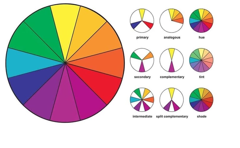
Colors are the palette with which artists paint their stories. Imagine a wheel that holds the key to unlocking countless possibilities – the color wheel. It is divided into primary colors (red, blue, yellow), secondary colors (green, orange, purple), and tertiary colors, forming the foundation of color theory. This wheel is not just a tool; it's a guide that helps us navigate the vast landscape of colors and their relationships. Color has 3 components: Hue, Value, and Saturation.
Hue refers to the pure, identifiable colors on the color wheel, such as red, blue, or yellow.
Value is the lightness or darkness of a color. It is determined by the amount of light that a color reflects.
Saturation, also known as intensity or chroma, refers to the purity or vividness of a color. A highly saturated color is vivid and intense, while a desaturated color is more muted.
Color Harmony and Emotional Resonance:
Now that we have our colors, how do we use them to create visual symphonies? Enter color harmony, a concept that brings balance and coherence to your artwork. Complementary colors dance in vibrant contrast, while analogous colors create a serene, harmonious melody. Here is a graph highlighting the different color relationships:
Consider the psychology of colors – red for passion, blue for calmness – and let the emotions you want to convey guide your color choices. As our journey continues, we encounter the dynamic force that shapes our visual perceptions – light. Light transforms colors, turning them into radiant hues and casting shadows that add depth to our creations. Understand the role of light sources, the direction of illumination, and the interplay between light and shadow. Mastery of these elements is the key to breathing life into your art.
Shadows are not just absence; they are storytellers. They ground objects in space, create a sense of depth, and invite viewers into a three-dimensional world. Experiment with shadows, play with their shapes and sizes, and watch as your artwork gains a tangible, realistic quality. Beyond color and light, consider the texture and reflection that define surfaces. Reflective light on glossy objects and the textured feel of different materials add layers of complexity to your creations. Dive into the details, explore the subtleties of texture, and watch as your art takes on a new level of richness and authenticity.
The Power of Experimentation:
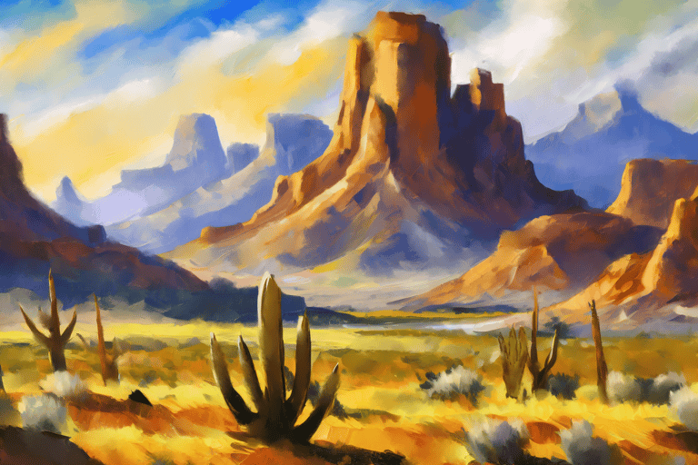
The true magic happens when theory meets practice. Don't be afraid to experiment with different color palettes, lighting scenarios, and artistic styles. Let your imagination run wild, and with each stroke, you'll discover new dimensions of your creativity. The more you practice, the more intuitive and confident you'll become in wielding the power of color and light. here's some of my work implementing the topics mentioned:
Color and light, like old friends, have been waiting for you to join them on this captivating journey. As you immerse yourself in the world of art and design, remember that every stroke, every shade, and every beam of light adds a unique chapter to your creative narrative. So, pick up your brushes, embrace the spectrum of colors, and let the dance of light and shadow unfold on your canvas – a journey that promises endless possibilities and boundless creativity.
*the further back subjects have cooler colors while closer subjects have warmer colors
What We Learned:
Color Wheel:
Definition: A circular diagram of colors, organized by their chromatic relationship. It is a fundamental tool for understanding color theory.
Relation: The color wheel serves as a guide to navigate the relationships between primary, secondary, and tertiary colors, aiding in creating harmonious and balanced color schemes.
Hue:
Definition: Hue refers to the pure, identifiable colors on the color wheel, such as red, blue, or yellow.
Relation: The choice of hue sets the basic tone of your artwork. Understanding how different hues interact on the color wheel helps in creating harmonious color schemes. For example, choosing analogous hues (those next to each other on the wheel) can result in a serene and cohesive palette, while complementary hues (opposite on the wheel) can add dynamic contrast.
Value:
Definition: Value is the lightness or darkness of a color. It is determined by the amount of light that a color reflects.
Relation: Value is crucial in creating depth and dimension in your artwork. By manipulating the value of colors, you can depict highlights and shadows, adding a realistic quality. Understanding how light affects the value of colors is fundamental for capturing the play of light and shadow in your scenes.
Saturation:
Definition: Saturation, also known as intensity or chroma, refers to the purity or vividness of a color. A highly saturated color is vivid and intense, while a desaturated color is more muted.
Relation: Saturation influences the overall mood and impact of your artwork. Vibrant, saturated colors can evoke energy and excitement, while desaturated or muted colors may convey a more subdued or serene atmosphere. Balancing saturation is crucial for achieving the desired emotional resonance in your art.
Color Harmony:
Definition: The use of color combinations to create aesthetically pleasing and balanced visual experiences.
Relation: Understanding color harmony helps artists and designers select color palettes that evoke specific emotions and convey a desired mood in their work.
Psychology of Color:
Definition: The study of how colors can affect human emotions, behaviors, and perceptions.
Relation: Considering the psychology of color enables creators to make intentional choices that resonate with viewers on an emotional level, influencing the overall impact of their art.
Light Sources:
Definition: Natural or artificial objects that emit light, illuminating the surroundings.
Relation: Awareness of different light sources and their characteristics is crucial for creating realistic and visually compelling art, as it determines how colors are perceived.
Shading and Shadows:
Definition: The technique of adding darkness to create the illusion of three-dimensionality and depth in art.
Relation: Shading and shadows play a pivotal role in grounding objects in space, contributing to the realism and depth of an artwork.
Texture and Reflection:
Definition: Texture refers to the perceived surface quality of an object, while reflection involves the bouncing back of light.
Relation: Understanding texture and reflection helps artists convey the tactile qualities of different surfaces, contributing to the overall richness and authenticity of their work.